Curriculum
Technical Analysis
Welcome and Introduction
0/1Technical Analysis Basics
0/4Markets and Market Indicators
0/5Trend Analysis
0/7Chart Pattern Analysis
0/18-
3 Chart Types
 Preview
 -
3 Key Rules
-
Bar chart patterns
-
Short term patterns
-
Candlestick Pattern – The most popular
Preview
-
Candlestick Analysis - 6 Principles
-
Doji
-
Double Doji – Breakout
-
Dragonfly Doji - Bullish
-
Gravestone Doji - Bearish
-
Hammer Pattern - Bullish
-
Shooting Star - Bearish
-
Bullish Engulfing
-
Beasrish Engulfing
-
Inside Bar- Bullish
-
Inside Bar - Bearish
-
Running stops
-
Multiple Bar Patterns
Breakout Patterns - Bullish or Bearish
0/10Indicators
0/8Supply and Demand - Volume Analysis
0/2When to buy and how ?
0/6Fishing for Top and Bottom
0/6The Technical Analysis - Summary
0/1Bonus Material
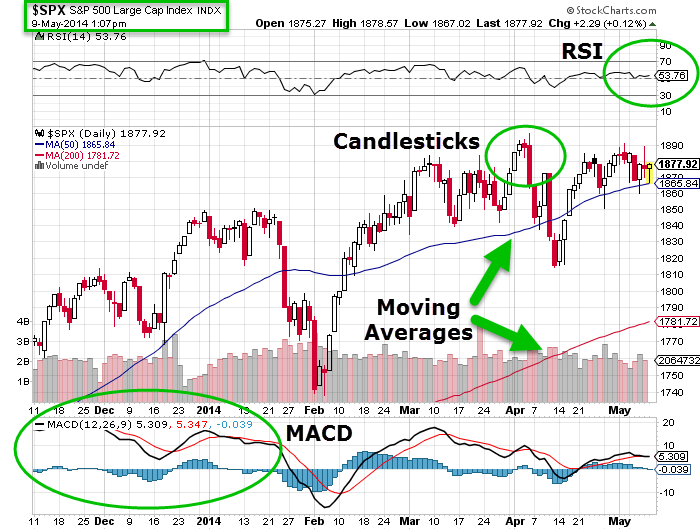
0/23 Chart Types
There are 3 main chart types:
1. Line chart
2. Bar Chart
3. Japanese Candlestick
This module’s focus will be on the Japanese Candlesticks; however, before we get to candlesticks, we will understand why we don’t use the line and bar chart.
1. The Line Chart
The line chart is the most basic chart type, and it uses only one data point to form the chart. When it comes to technical analysis, a line chart is formed by plotting a stock’s closing prices or an index. A dot is placed for each closing price, and a line then connects the various dots.
The line charts can be plotted for various time frames, namely monthly, weekly, hourly etc. So, if you wish to draw a weekly line chart, you can use weekly closing prices of securities and other time frames.
The advantage of the line chart is its simplicity. With one glance, the trader can identify the general trend of security. However, the disadvantage of the line chart is also its simplicity. Besides giving the analysts a view on the trend, the line chart does not provide any additional detail. Plus the line chart takes into consideration only the closing prices ignoring the open, high and low. For this reason, traders prefer not to use the line charts.
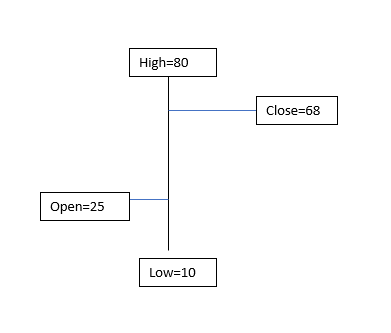
The bar chart, on the other hand, is a bit more versatile. A bar chart displays all four price variables: open, high, low, and close. A bar has three components.
1. The central line – The top of the bar indicates the highest price the security has reached. The bottom end of the bar indicates the lowest price for the same period.
2. The left mark/tick – indicates the open.
3. The right mark/tick – indicates the close.
For example, assume the OHLC data for a stock as follows:
Open – 25
High – 80
Low – 10
Close – 68
For the above data, the bar chart would look like this:
While the bar chart displays all the four data points, it still lacks a visual appeal. This is probably the biggest disadvantage of a bar chart. It becomes tough to spot potential patterns brewing when one is looking at a bar chart. The complexity increases when a trader has to analyze multiple charts during the day.
Hence, for this reason, the traders do not use bar charts. However, it is worth mentioning that there are traders who prefer to use bar charts. But if you are starting fresh, I would strongly recommend the use of Japanese Candlesticks. Candlesticks are the default option for the majority in the trading community.
Brief History of the Japanese Candlestick
Before we jump in, it is worth spending time to understand in brief the history of the Japanese Candlesticks. As the name suggests, the candlesticks originated from Japan. The earliest use of candlesticks dates back to the 18th century by a Japanese rice merchant named Homma Munehisa.
Though the candlesticks have been in existence for a long time in Japan, and are probably the oldest form of price analysis, the western world traders were clueless about it. It is believed that sometime around 1980’s a trader named Steve Nison accidentally discovered candlesticks, and he introduced the methodology to the rest of the world. He authored the first-ever book on candlesticks titled “Japanese Candlestick Charting Techniques” which is still a favourite amongst many traders.
Most of the candlesticks pattern still retains the Japanese names; thus giving an oriental feel to technical analysis.
Candlestick Anatomy
While in a bar chart the open and the close prices are shown by a tick on the left and the right sides of the bar respectively, however in a candlestick the open and close prices are displayed by a rectangular body.
In a candlestick chart, candles can be classified as a bullish or bearish candle usually represented by blue/green/white and red/black candle
Candlestick chart example –
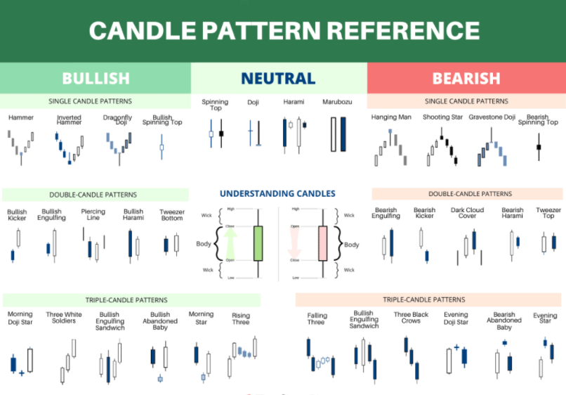
Candlestick chart reference cheat sheet –